
A strategic technical breakdown on optimizing CRI, R9, and CCT to elevate visual merchandising and drive commercial performance.
When a customer walks into a retail showroom or boutique, their purchasing decision begins seconds before they touch a product.
Visual appeal dictates perceived value, and nothing shapes visual appeal quite like lighting.
However, many businesses invest heavily in interior architecture, high-end fixtures, and product curation while ignoring a critical technical detail: the accuracy and tone of their artificial light sources.
Inaccurate illumination distorts hues, makes premium materials look dull or washed out, and creates discrepancies between what a customer sees in-store and what they view at home.
Achieving true product presentation requires mastering two core lighting metrics: Color Rendering Index (CRI) and Correlated Color Temperature (CCT).
Mastering these metrics ensures that rich fabrics reveal their true depth, intricate textures pop under crisp highlights, and fine metallic finishes radiate with authentic brilliance. By strategically balancing warm and cool tones, lighting guides the eye, highlights focal collections, and crafts an immersive atmosphere that invites customers to linger. Ultimately, high-performance lighting bridges the gap between seeing a product and desiring it—transforming a casual browse into a confident purchase.
1. The Power of First Impressions: Why Display Lighting Matters |
The human eye relies on reflected light to perceive color, texture, and depth. Before a shopper reads a price tag, touches a fabric, or tries on a piece of jewelry, light has already formed their initial impression of that product’s quality.
Low-quality light mutes vibrant colors. A rich crimson dress can appear a dull maroon, stripping away its visual appeal.
Mismatched lighting leads to customer dissatisfaction when products unboxed at home look different than under store lights.
Poorly illuminated displays give retail spaces a flat, uninviting atmosphere, shortening customer dwell times.
The Core Principle: Exceptional display lighting requires a harmony between two distinct factors: how accurately colors are revealed (CRI) and the thermal atmosphere created by the light (Color Temperature)
2. Decoding Color Rendering Index (CRI) |
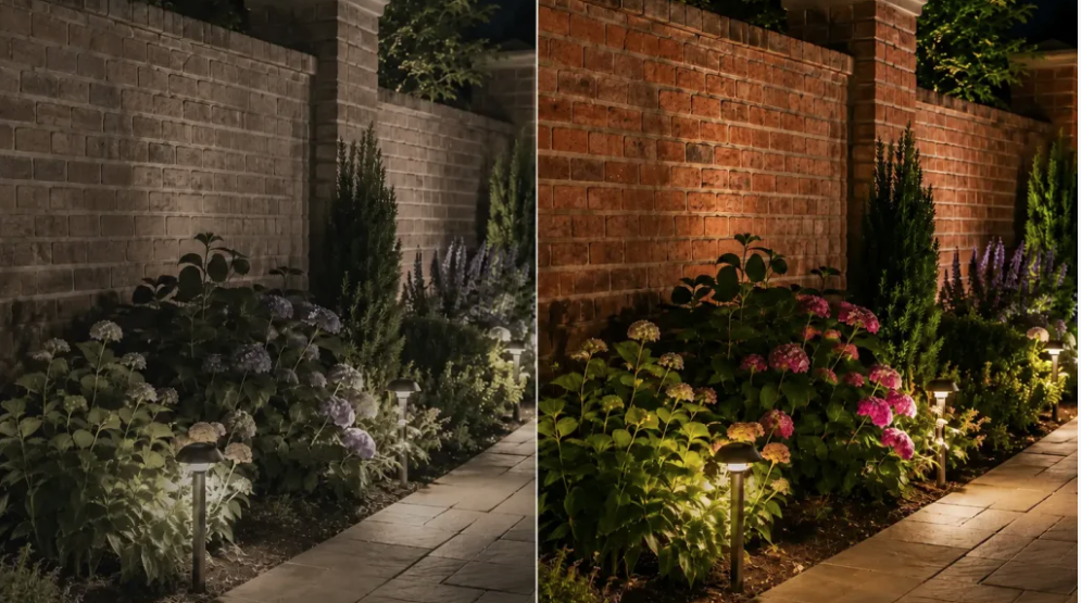
The Color Rendering Index (CRI) is a metric scored from 0 to 100 that measures how accurately an artificial light source renders the true colors of an object compared to natural sunlight (which holds a perfect score of 100 CRI). When an artificial light source lacks full-spectrum output, certain color wavelengths are missing. As a result, objects illuminated by that light cannot reflect those missing wavelengths, making colors look dull, gray, or artificially shifted
The Critical Role of R9: Why Standard CRI Isn’t Enough
The average rating for standard Color Rendering Index—commonly designated as Ra—relies on a limited evaluation of eight pastel test colors spanning R1 through R8. Because this conventional assessment leaves out R9, it fails to measure a light source’s capability to render deep, saturated red wavelengths. Light sources lacking sufficient red spectral energy introduce significant visual distortions across various commercial displays. Rich timber veneers and polished mahogany lose their warm undertones and take on a dull, ashen tint. High-end crimson leather items look muted rather than luxurious, while fresh food displays—including cuts of meat, ripe produce, and vibrant floral arrangements—appear unappetizing and flat. Furthermore, under-saturated lighting in dressing room mirrors strips away natural complexion warmth, leaving human skin looking pale or unhealthy.
To guarantee true-to-life color rendering, commercial lighting specifiers evaluating spotlights, track systems, or downlights must check both the general CRI rating and the specific R9 score. High-performance retail fixtures ought to deliver a baseline CRI of at least 90 combined with an R9 output exceeding 50.
3. How Correlated Color Temperature (CCT) Drives Consumer Behavior |
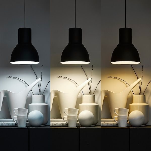
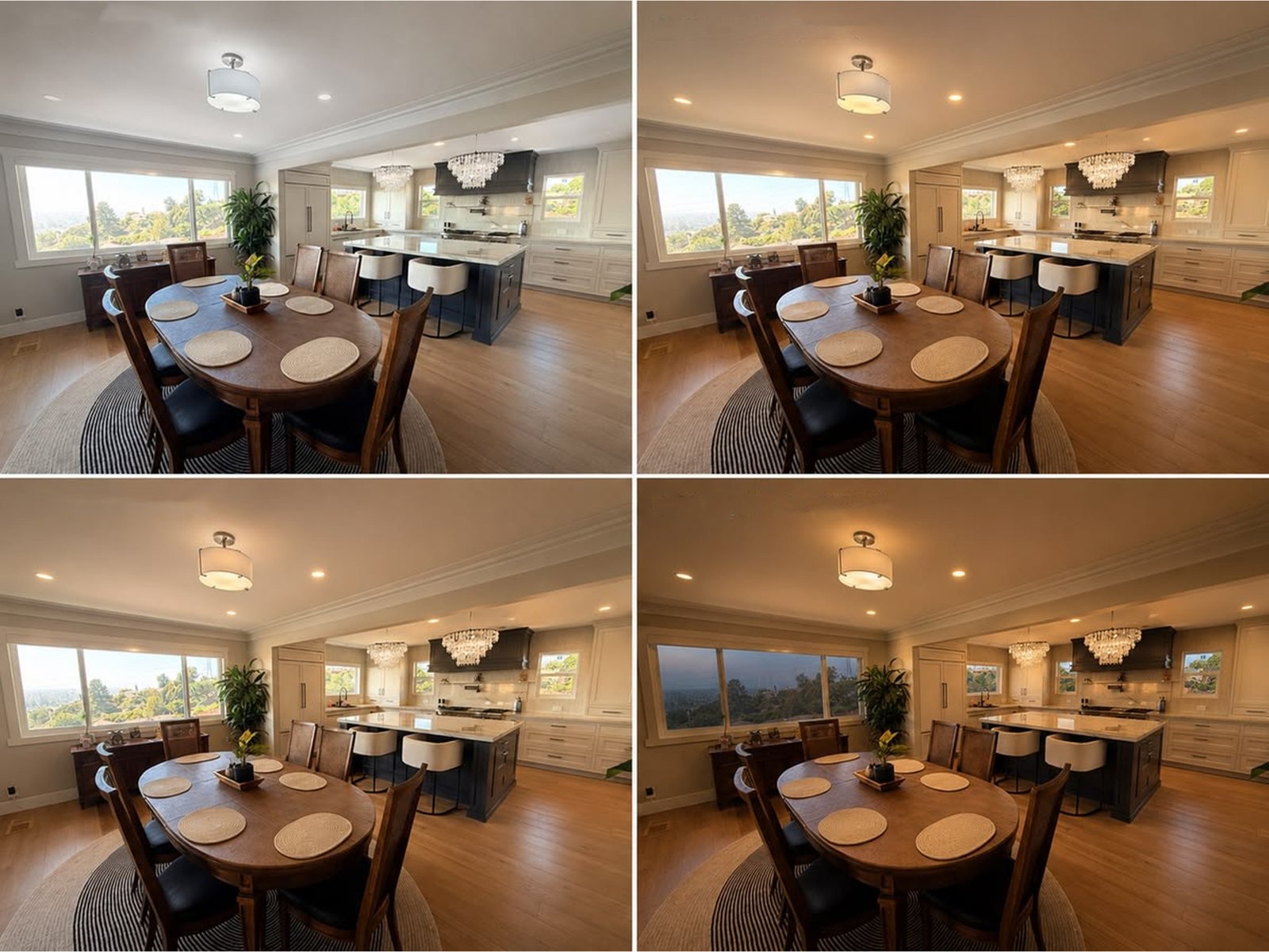
While CRI guarantees color fidelity, Correlated Color Temperature (CCT)—measured in Kelvin (K)—defines the thermal
atmosphere and appearance of light, ranging from warm golden tones to cool crisp daylight.
Creating Ambiance with Warm Light (2700K – 3000K):
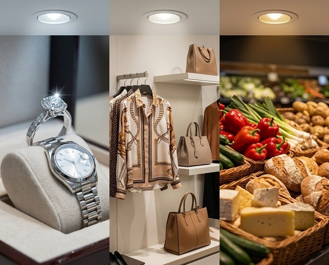
WARM WHITE Lower color temperatures emit a gentle golden glow that relaxes shoppers and encourages longer browsing times. This makes warm lighting ideal for boutique environments, artisanal goods, fine wines, and high-end leather displays where comfort, luxury, and warmth are key selling points.
Achieving Clarity with Neutral & Cool Light (3500K – 5000K):
NEUTRAL WHITE / COOL DAYLIGHT Higher color temperatures provide sharp clarity and modern energy. Cool white illumination eliminates subtle color shifts in clothing, prevents yellow tinting on cosmetic displays, and reflects brightly off polished metals, silverware, and gemstones.
For specialized architectural and high-end display lighting, standard CRI can occasionally miss nuances in saturated colors. Modern lighting specifications increasingly incorporate the IES TM-30-18 evaluation system, which utilizes two primary metrics:
IES TM-30-18 Key Evaluation Metrics:
Fidelity Index (Rf ): Evaluates color accuracy across 99 color evaluation samples (compared to CRI’s 8 basic pastel samples), providing a comprehensive picture of overall naturalness.
Gamut Index (Rg ): Measures color saturation levels across the spectrum. An Rg score near 100 indicates natural saturation, ensuring merchandise looks vibrant without becoming unnaturally oversaturated.
Combining a CRI of 90+ (with R9 ≥ 50) alongside a balanced CCT and verified TM-30 metrics ensures merchandise is displayed with maximum visual impact, authenticity, and precision.
5. The Intersection: Application Matrix by Product Category |
CRI and CCT are independent parameters that must be specified together. Choosing high CRI alone will fail if the CCT is mismatched to the product material.
Upgrading to high-CRI (90+), properly color-balanced lighting delivers tangible commercial returns:
Higher Conversion & Sales Volume: Products illuminated with full-spectrum, correctly matched light appear higher in quality, increasing perceived value and accelerating point-of-sale decisions.
Lower Product Return Rates: Preventing disparity between store lighting and natural daylight eliminates “color mismatch” customer returns after unboxing at home.
Enhanced Store Ambiance & Dwell Time: Tailored color temperatures create a comfortable atmosphere that encourages shoppers to linger, explore, and engage with display collections.